Yay, we're back to exclamatory pun titles! Can a brutal suicide be far behind!?!? Let's hope not! If you've been to
the site tonight, you may have noticed that the Witch take-over is no more. If you're slightly less observant, you may have at least noticed the new banner. If you noticed neither, then you're either visually impaired or you just don't give a flying frell about our film. I have the numbers on that, odds are you're in the latter group, statistically speaking.
Anyway, I know the tantalizing stuff I promised a little while back hasn't shown yet, but don't worry, it's on its way! Drew and I have been having a little back and forth on the pre-viz stuff, and while the nature of my upcoming work is going to be slightly different than advertised, it's still going to translate to cool, daily blog content for you guys. Starting this week!
But in the meantime, how about a brief rundown of the new banner? It was pretty straightforward, as far as assembly, but it might be of some interest anyway. As will almost every shot in this film, it starts with a shot of Mare filmed over two years ago.
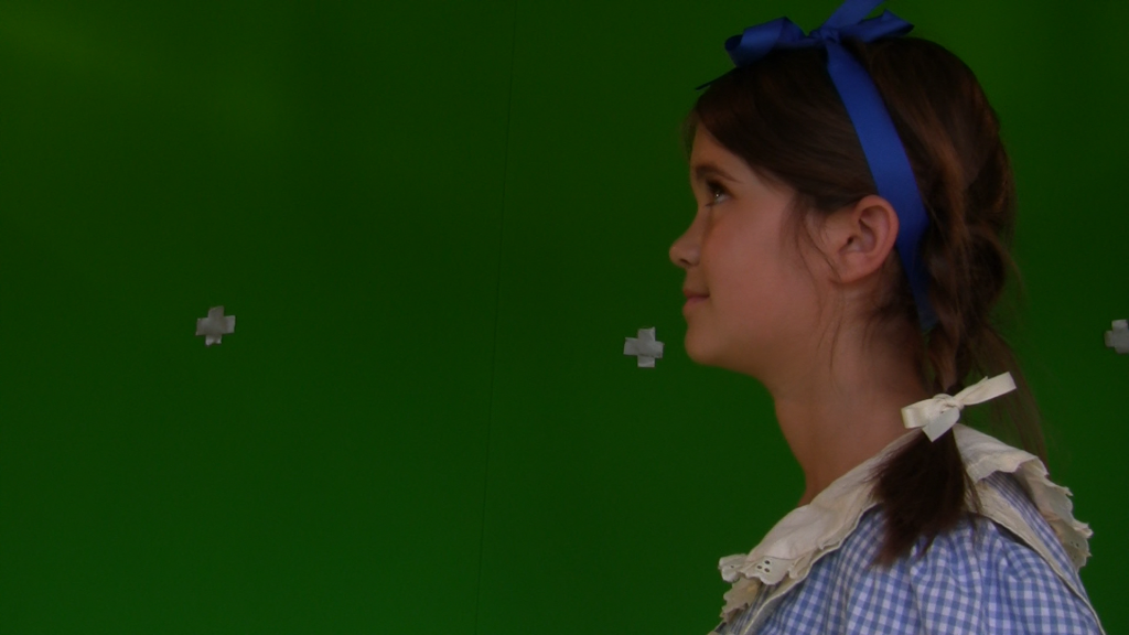 |
| This was a really easy performance to get. We just told her gullible was written on the ceiling... |
And then we have a shot of Stacey, filmed a couple months ago.
 |
| And she is of course imagining Brett Favre... |
Both very straightforward to chromakey, though the Dorothy element needed a little masking to remove our nasty old duct tape markers. Then I wanted to get the farmhouse in there. The model is the same one used in the
teaser trailer, but with some revamped texture work done to it, and rendered with a nice dusky sort of lighting scheme.
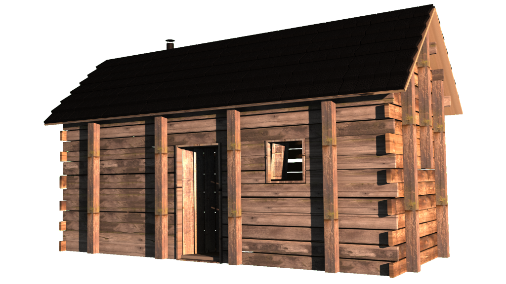 |
| Abraham Lincoln could only DREAM of someday making his house float inside his writing... This one's for you, Abe. |
That was just popped in under our ladies, with a blurred out, stolen image of some hedges. Sean has me do these at a really weird resolution so we have a nice wide banner, and it extends out there even for people with higher resolutions. But it makes framing weird. You need to leave a lot of negative space, some for the title itself, and some just uninteresting background stuff that can stand to be cropped for people with smaller resolution monitors. Here's the image sans logo:
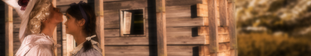 |
| We brought William Wyler and Robert Surtees in to consult on this one... Get it? |
And then strictly for my pleasure, I did up one at the same aspect ratio and resolution as the actual film, with framing that's more to my liking. This actually sort of ties into my discussion with Drew. More on that later in the week!
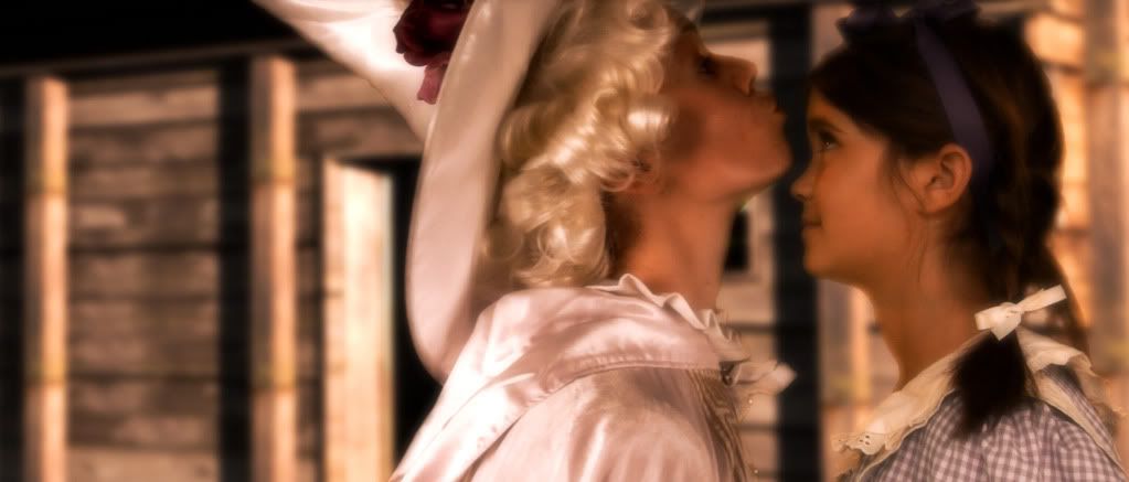 |
| Clearly Aunt Em and Uncle Henry did NOT teach poor Dorothy about stranger danger... |

GREAT! Great, great, great, great, GREAT!!!
ReplyDeleteI love seeing bit more and bit more of this film being shown, even in partially completed stages! I LOVE the Kiss bit, hope to see a perfectly seamless match of the lips-to-forehead edit!
Thanks for the GREAT Work, Guys!! Good Luck and Keep it Coming!