
Our long time readers (I'm so sorry, you poor souls) may remember that when Sean and I want to update the site, we have to do all of it ourselves. Well, if you've been to the site recently, you may have noticed that it's received something of a face-lift. We were very tired of the previous look, and we hadn't changed anything since November.
The original idea was to keep it all essentially the same, just slot in some new content and a new banner. As I was getting started on a cornfield banner, modeled after this shot, Sean came to be with big, wide puppy-dog eyes and made a tentative suggestion for a change. He appealed to our shared love of the old version of The Force.net, and suggested we ditch the tiling green background bricks and replace it all with super-large banner.
I liked the idea, and as you can see (spoilers) we went with it. It required a little more thought than doing an old-style rectangular banner overlay, and took a few more versions to nail, but the process was essentially the same. As will be the case for almost everything we do from here on out with the film, it all started by going back to the Dorothy footage. Since I'd storyboarded the sequence (smart suggestion Drew, but I still hated every minute of it), I knew exactly which take I wanted.
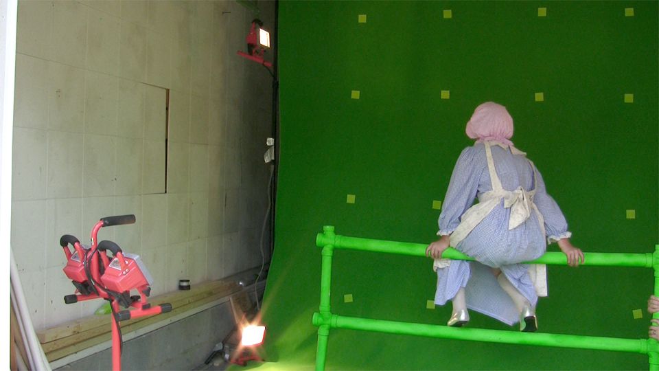 |
| It's not a proper feature until you endanger the safety of a child with a rickety PVC construct. |
 |
| "How you livin', gir'? Come for the corn, stay for the company, amirite?" |
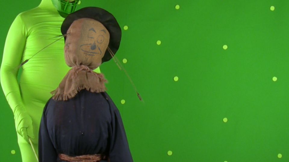
Next on our agenda was buttons. Sean and I have never been satisfied that Lion wasn't represented on one of the buttons. You may recall the Cast button used to have Dorothy, Crew had Scarecrow, and Gallery had Woodman. Back in November when we were doing our last major update, we tried to add a new button with Lion on it, which would take you to the video page. Unfortunately, most browsers in most computers cut it off, so we couldn't add it without making the site scroll. Which added a whole host of ugly new problems.
So our plan for this update was to put the famous five on the Cast button together, and then get Witchy on the other two. Which you can see that we did. We were then going to just have a slightly modified version of the old button style, but the new banner style posed some issues. Sean again had the bright idea, this time for a M*A*S*H style signpost, which would fit into our kind of earthy vibe. I put together a quick CGI signpost, textured with wood and our buttons.
 |
| Oh wow, the five of them together. And to think it only took us... Three years. |
Of course, Sean and I wanted the site to go up Saturday night, and we didn't get home from Toto work until around five. I had to put some finishing touches on the previously prepared material, like getting Toto on that Cast button, and then help Sean with his promo card and some other bits and bobs. Which meant whatever I ended up doing for the splash panel would have to be fairly quick work.
I opted to keep it in the China Country, since that's pretty simple from a modeling perspective, and not terribly render-intensive. I selected a shot from one little moment I invented on the day as we were filming Toto. Since every shot looks down on poor little Toto up until this point, I thought it'd be fun to give him his one moment as a giant.
 |
| I'm so sorry, Drew. I didn't know what else to do... |
All that was left after that was my background. I modeled up a quick white brick wall, and a China Country figurine based on a Denslow illustration. Seriously, go check that color plate. I even gave it some blue trousers that ended up just below the matte line. The addition of my Toto element and one of the many stock cloud photographs I've taken rounded out the final image.
 |
| Eat your heart out, Ted Danson. (Somebody somewhere gets that, and you're WELCOME, dammit. I know, I saw it too.) |
I saw the updated site images a few days ago and LOVED LOOOOOOOOOOOOVVEEEDD It!!
ReplyDeleteKeep up the Great work, because it IS GREAT Work you're all doing!!
Thank you!