So yeah. There is no team of artists putting content on the site. There is Sean, the web designer and Duke of Url, and myself, who contributes whatever images and Photoshop may be necessary. Though Sean's no slouch in THAT department, either. He used to do it for a living. And it crushed his soul. Anyway... We're aware that there isn't really a lot on the site. The reason for that is because when Sean and I have time for that kind of stuff, we generally... y'know... spend it working on the ACTUAL movie. Because why promote something that will never exist? But with Drew away this week, and me trying to avoid editing all this footage that is, quite frankly, very bizarre and abstract now that I've forgotten what all those shots are even supposed to BE... Sean and I decided it was time to do a little site maintenance.
First step was the promo photography gallery, which we did a couple nights ago. Most of the images already existed, on the site even, but Sean corralled them all together and uploaded the full-size versions, and I created that Woodman promo shot to sort of help "launch" the gallery. Think of it as the Super Mario 64 to our gallery's N64. Or, if you don't know what that means... DON'T think about it. You'll only confuse yourself.
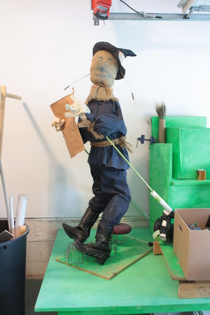
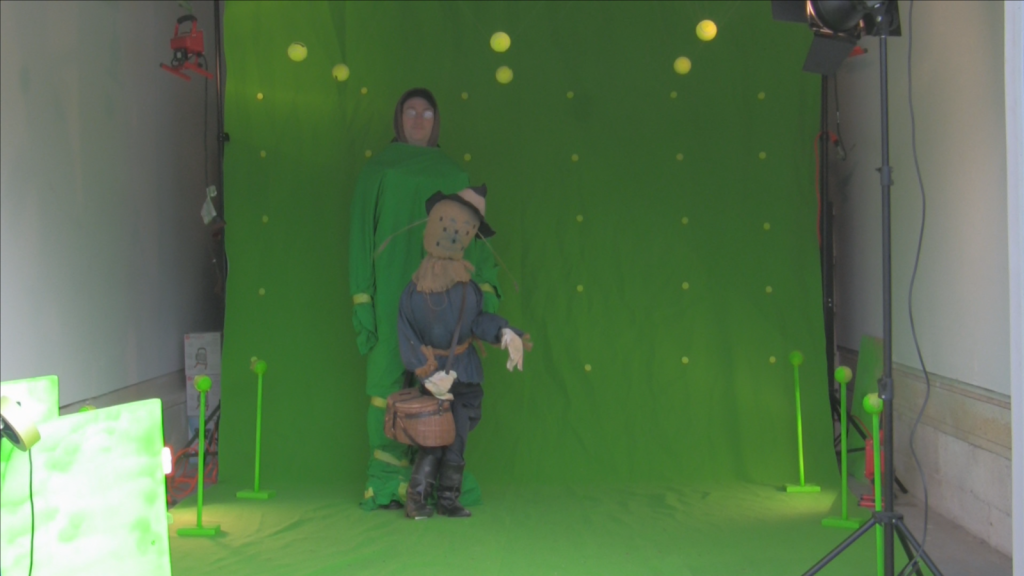
Second... Obviously you can't have a Woodman promo image and not have one of Scarecrow. So Sean agreed to do some Scarecrow photography if I agreed to do the Photoshop work. Why would an ex-professional Photoshop artist ask a very UNprofessional Photoshop artist to do Photoshop work for him? Laziness. I'll explain. See, Sean doesn't have the green-screen or professional lighting equipment. That's all with me. So while he did a terrific job posing the Scarecrow puppet in a very Denslow fashion... THIS is the image he ended up with:
Nobody's going to key out that background. No indeed. Scarecrow needs to basically be traced all the way 'round by hand (by hand in the computer... is that POSSIBLE!?!?) to be cut out of that sucker. That includes cutting around that damned WHEAT. There's Denslow again, pissing me off. With that wheat. The Devil's friggin' wheat. We gave our Scarecrow that wheat. And it kept falling out. Getting little grains of wheat on the green-screen. Little grains of wheat that wouldn't sweep off. Stuff is like VELCRO. And even when the puppet IS on green-screen, they don't key out well. Especially in anything wider than a close-up. Again I say; "Poor Drew More." When we yanked Scarecrow to simulate the Lion's mighty swipe, his wheat broke off. Sean suggested just replacing it, as it's a fantasy film, the wheat can survive if we want it to. But I did NOT want it to. I wanted to save hours of roto later down the line. So we EXORCISED them demons.
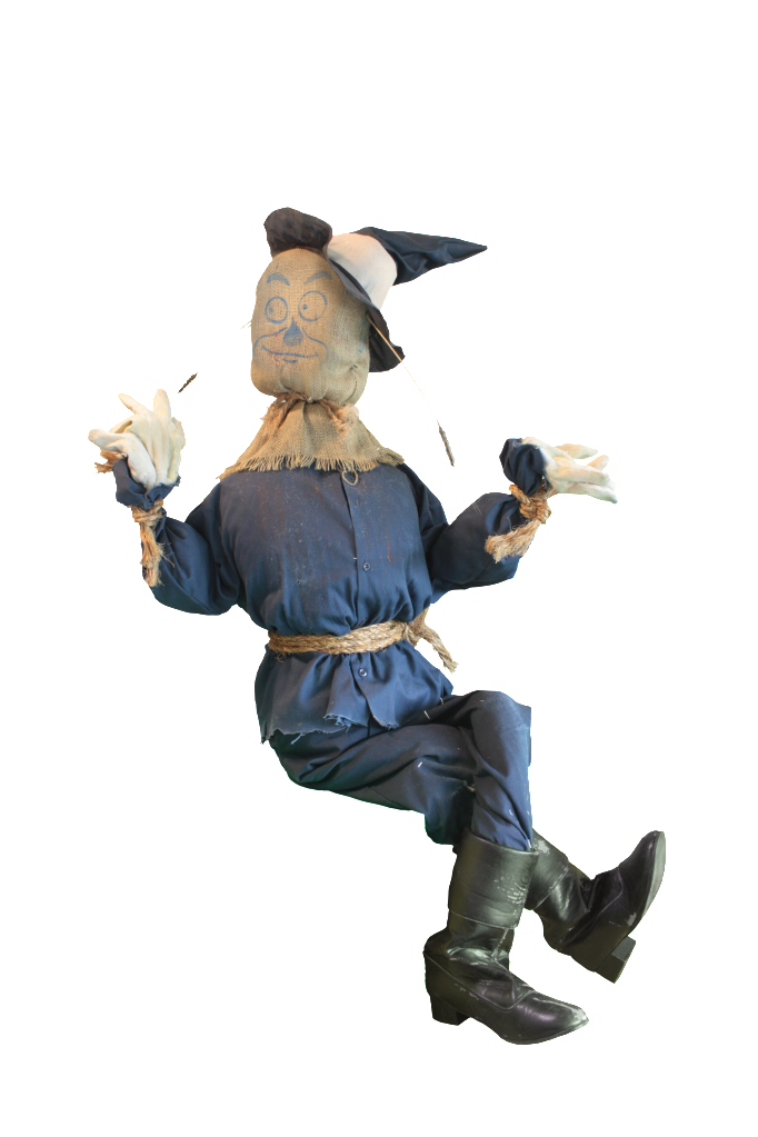
But for promotional purposes, the wheat should be there. And it was. So I had to cut around it. And I did.
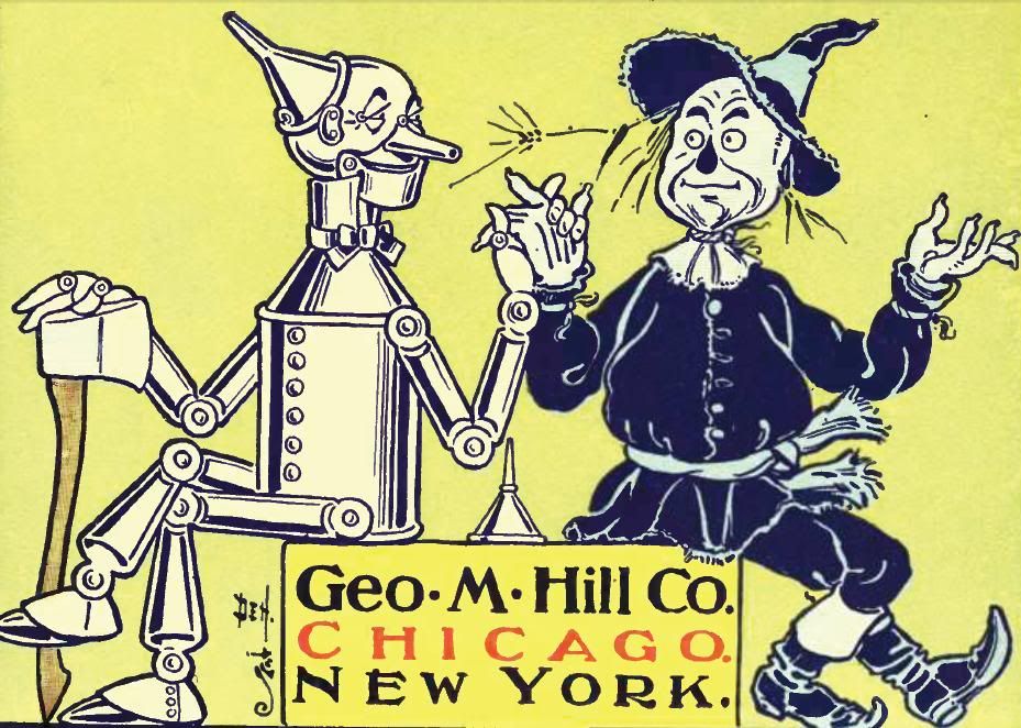
And then I did it AGAIN. Because Sean and I also wanted to do a new wallpaper, and we wanted it to be our version of this iconic Denslow image:
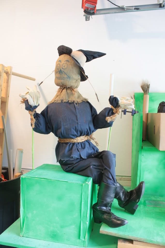
So Sean put the Scarecrow puppet in that pose and took a picture. And he matched it up pretty nicely. But this is the image I got:
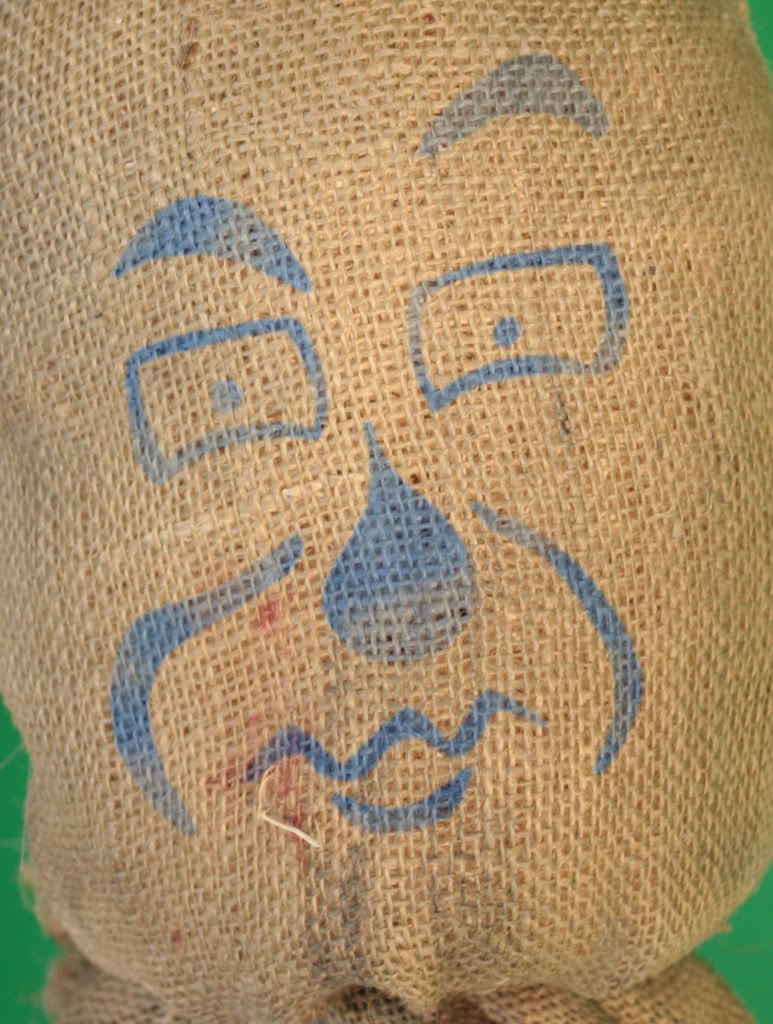
Same background as before. So more of my time spent tracing hay. And then I needed to do up a face for him, something to match the Denslow drawing a little better than our painted on Neutral face.
You may also notice some slight alterations on the boots on both images. They were the closest match we could find in his size, but they have these nasty zippers and laces down the back. Which will have to be dealt with every time we see the backs of his boots. So don't expect much of THAT in the film you... rear ankle fetishists, you... Anyway with Scarecrow taken care of, Woodman was up next. I ranted last time about how Woodman can't bend the way Denslow draws him bending. And that is still true. Still really, very, remarkably true. So I spent a lot of time posing Woodman in ways that were physically possible. And it wasn't good enough. So I had to break the rules. As you can see in this close up... that's NOT how ANYBODY'S hip is supposed to be... Ever...
Also... For the kids playing at home, making a CGI character interact with a real one... isn't fun. Do drugs instead. But MY drug of choice is pain, so I went for the CGI thing... So I spent quite a bit of time getting them to hold hands (commence the slash-fic), faking shadows cast on Woodman by Scarecrow, positioning fingers, that kind of thing. And then I was ready to do their chair. Denslow drew them sitting on a square, so I had them sitting on a cube. Makes sense to me.
But Sean didn't like it. He said is was too 2D. I told him that a cube is 3D by DEFAULT, but he wasn't having any of it. He wanted a crate. So I compromised and built a yellow crate:
And redid all my shadows and junk. Worth it?
Hey, speaking of the Lion... I did, earlier? Remember? I'm not lying, but you can check back if you like. Working on these promo images, Sean and I were reminded of the fact that the lion has almost zero presence on our website. And we felt bad. We felt even WORSE when we realized we didn't even have a finalized design for the fella. Sean had done this piece of concept art years ago, after he wrote the script, before we even met:
And it's a nice image. But it's not exactly what I want the Cowardly Lion to look like. So I did my own mock-up with the sort of proportions I envisioned. I won't show it here, because it's fairly awful. Just imagine a real lion, but that looked worse and had a big head. There's your mock-up. That's the mock-up. So this sparked a lot of somewhat heated conversation that slowly cooled down. Well, the conversation was never really heated because of the Lion. It was heated because Sean and I couldn't agree on a hat, and some angry words were exchanged. Seriously, that's a true story. We even fought about a belt once... The only time we ever argue is about something miniscule. The smaller the detail, the bigger the fight. I might film us whenever we get around to discussing the background props in the China Country.
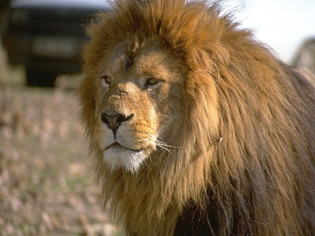
But anyway, Sean and I discussed the Lion in quite a civil manner, there was a thoughtful exchange of ideas, a bit of compromise, and Sean agreed to whip up something in Photoshop. I say "whip up," but I didn't get to see it until the next day. And he spent hours on it. He took this image of a real life lion we found online:
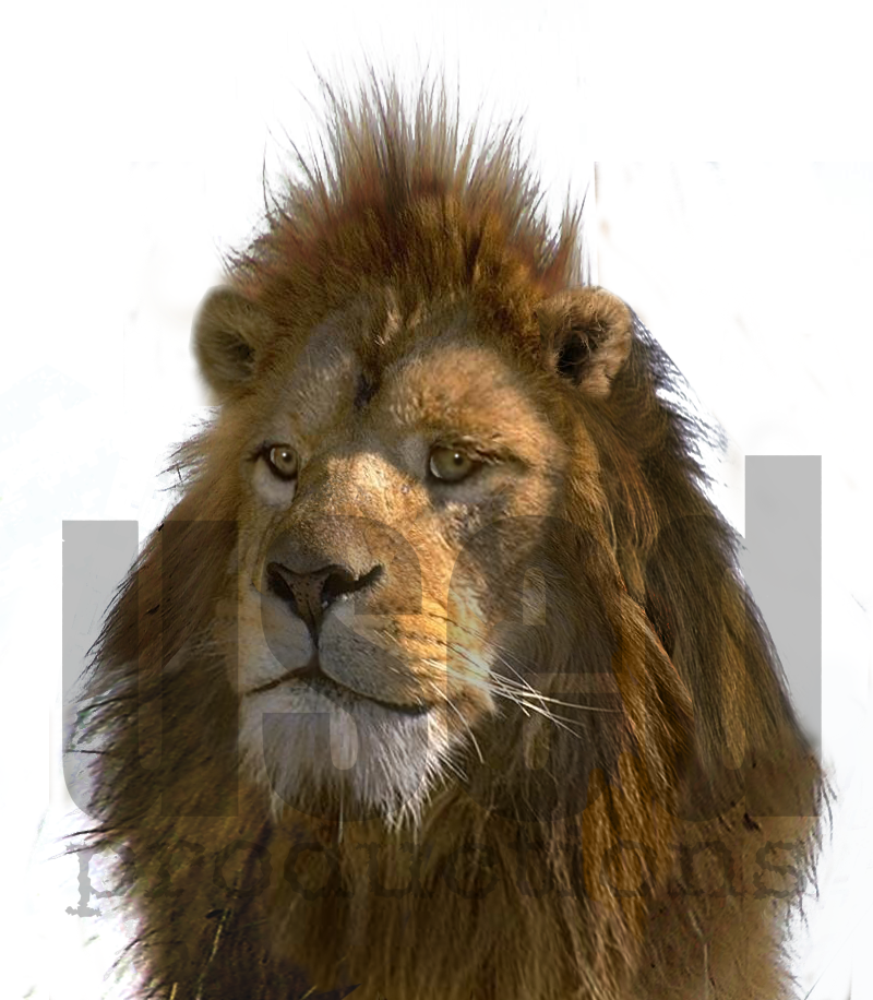
And turned it into this:
Which we were both in love with. While the real Lion will be CGI, and this is a Photoshopped image, it is EXACTLY what we want our Lion to look like. And it's EXACTLY what our Lion WILL look like. Seriously, if we can't find somebody to recreate precisely this for us in CGI, well then... I dunno... Movie canceled, I guess. Or maybe we'll dub in new dialogue and have the third companion be the Rowdy Welshman or something. We like the look, is what I'm saying. And thought maybe it was time for the Lion to have a presence on our site. Which meant a new banner, as the old one was getting a little stale.
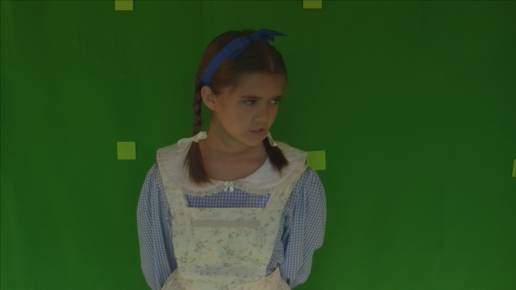
Ever since banner 2.0, the banner has become my department, since Sean does all the other work for the website. So I decided the basic layout would be Dorothy and Lion on the right, from the shoulders up, and then Scarecrow and Woodman lagging behind, goofing off. Sean had taken care of Lion for me, so I just had to create the rest of the image and composite him into it. First up, I needed some pictures of Dorothy and Scarecrow. So I dug through the raw footage, and found some appropriate shots. The shot of Dorothy is actually from the only scene in the movie that I wrote, and takes place shortly after they meet the Lion. So I thought it appropriate:
Then I grabbed an image of the Scarecrow from our puppet photography a couple of months ago:
As you can see, there are tracking markers on his face. So I had to give him a new one. Which I wanted to do anyway, as it bothered me how unexpressive he is in the current banner. So I Photoshopped up a suitable expression, which I was quite pleased with, and comped it onto his face.
Then I just had to remove his Cool Lime Steven Lowry backpack, and he was ready to go. Dorothy was quite a clean key. Woodman was a fairly simple alteration of the chopping pose I created for the concept scene. Well, simple when compared to sitting him on a box and making him hold Scarecrow's hand. Then I dropped them over a proof-of-concept still provided by our environmental artist. I had to adjust the grading a few times before Sean and I were both happy with it, but we ended up with a decent little banner, which you can see at the top of this page. I provided him with a mask so that he could put the characters on top of his logo. So we're, like... bringing the magazine rack to your COMPUTER!
And that's the saga... This stuff doesn't make itself. Which is why we have so little of it. This journal entry has all been a trick. Hopefully now you feel so sorry for my wheat-tracing cramped hand that you will never expect there to be new content again...




No comments:
Post a Comment