That's not to say there's been NO progress. We move along in some way every day. But it's not always in an, "OOOH, check out this EXCITINGLY MASSIVE step forward!!!" way. For example, Drew's been working on tracking my scarecrow facial animation to some shots of the puppet. Some shots of the puppet that I foolishly didn't put markers on his face for. Poor Drew.

As for me, well, I've been up to a bit. So coming your way is a journal entry stuffed with imagery. I'm trying to apologize for the prolonged silence, and win back your favor. I promise it will never happen again. Please love me. I'm needy. My emotional growth is stunted.
So... What HAVE I been doing? For a start, as I had a bit of down time on the CGI side of things, I decided to put a little time in on pencil and paper. My traditional art skills are not at all what they should be, and I've been attempting to rectify that. So I took the time to sit down with a pencil and paper. And also Photoshop. First up is a little Quadling action:
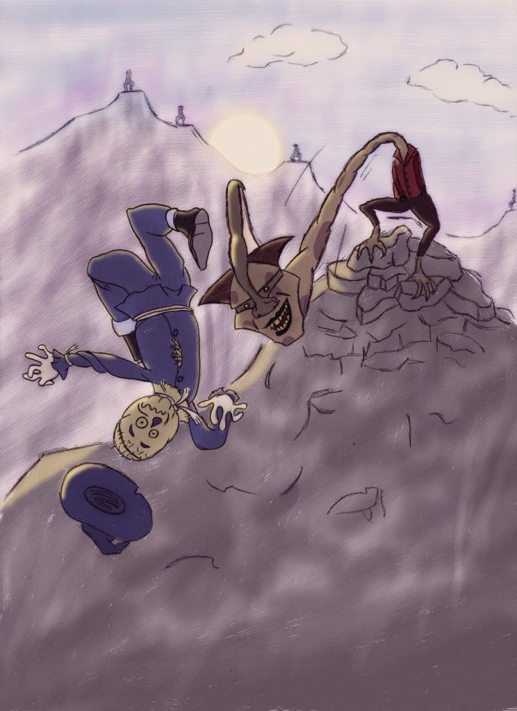
You'll notice that the hammerhead has seen a significant redesign, courtesy of yours truly. All the adventures on the way to Glinda's palace are sort of my baby, I had to fight Sean a bit to get all of them in there, and he's been kind enough to step back and let me go all-out friggin' crazy with this stuff. We've said before that we want to stay true to Denslow, wherever possible, and we really do. But sometimes that just isn't feasible (more on THAT later...). The hammerheads were always one of his weaker efforts anyway, and when translated into reality end up looking... well... INCREDIBLY phallic, if I'm being frank, here. Which is why I won't show any of the earlier designs. This isn't a porno site. Though it'd probably get more hits that way...
Anyhow, I tried to approach the hammerheads, as Sean did with the winged monkeys, from a sort of pseudo-scientific, evolutionary stand-point. What would a creature with no arms and an extending neck who lived in the mountains REALLY be like? So for a start, I figured something sort of reptilian. The legs would have multiple joints to allow for optimum balance and maneuverability, because if they fall they're going to have a hard time getting up. I also thought they'd have beady-little eyes, which they would need to protect, so they have an exaggerated brow and cheekbones, and a crest based on that of the Parasaurolophus There are also a few more gruesome surprises that I'll save for the movie.
Next up, we have the pay-off of the Lion's arc, his battle with the great spider:
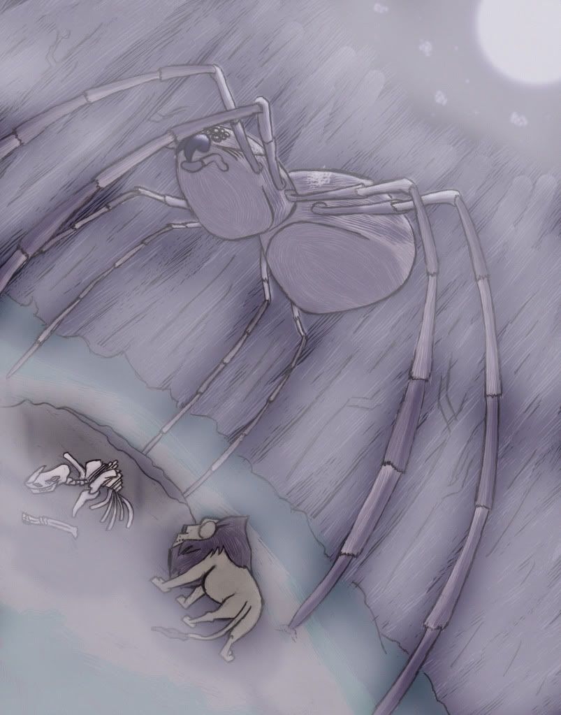
I have some quite specific imagery in mind for this scene, and I need the spider to have very long, spindly legs. For that reason Sean suggested that we base our design on the Wolf Spider, which I've done here, albeit in a stylized form, and which we'll continue to do when the time comes to bring the monster to life. For your reference:
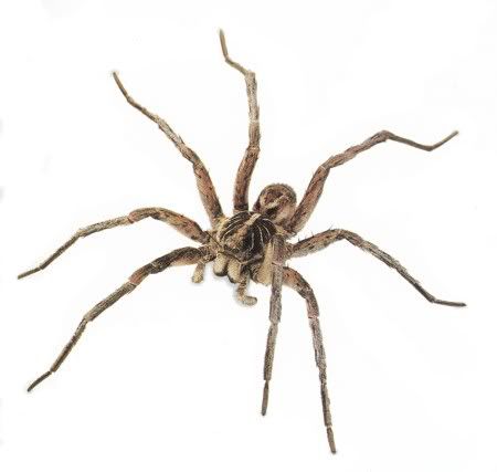
Did it give you the creepy-crawlies? Always gives me the creepy-crawlies...
Then I worked on an image that's ALSO from that southward journey, a moment from the battle with the angry trees:
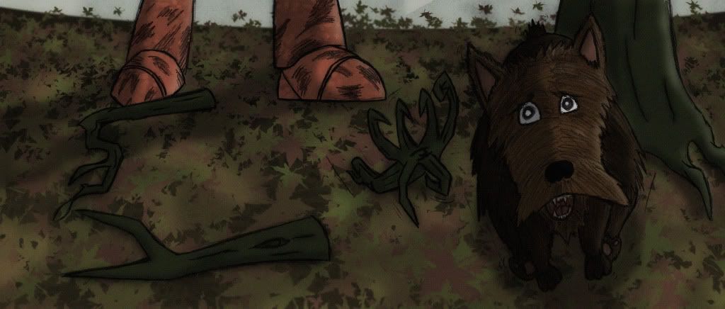
At some point in the scene, Woodman will chop a branch off and it will plop down to the ground, and then promptly scuttle after poor, startled Toto like Thing from The Addams Family. It's important to me that we make Toto a real character, who has his own little moments in the film, but it's hard when he's so much shorter than the rest of his companions.
For the next piece of concept "art" I moved away from the misadventures en route to Glinda's pad, and indeed away from Photoshop coloring as well. I decided to try out an actual painting, for the first time in a long time, and for the first time ever with acrylic paints. I opted to go with a scene from earlier in the film, featuring Scarecrow's feathery savior:

The results are unspectacular, but serviceable. About the only aspect I'm happy with is the way the Scarecrow is contorted. Expect to see that make its way into the film.
So. After my rash of concept "art" creation, Drew and I had a chat, and as is his wont, he had a fresh idea for Nick's eyes. He's been discussing with me these various ways to give them a bit more life, and to give the character of the Woodman more soul. They're all good, we'll be using most of them, but I'm only going into detail on one, because only one was my responsibility. The rest will be handled in the composite by my main man Mr. Morin.
What was this suggestion, you ask? Well shut up and I'll TELL you. Pushy... He thought, since the eyes are no longer tin, but crystal, that there's no need for them to be frozen in place, and that moving them around might give a little extra life to this frozen character. I agreed with him, and so it fell to me to handle that animation. We also figured that while I was at it I'd animate a couple of other bits of the Woodman for some interaction he has with the live-action characters later in the scene. So I created a scene file that was the same number of frames as the entire concept scene, and went to town.
Rigging the arms, left leg, and head for the interaction was the easy part. Knocked it out fairly quickly. The eyes took a little more time. Their direction was parented to a cube, which I then animated around in space, based on what Woodman might be looking at at any given moment in the scene, using the live-action footage as reference. Here you can see the eyes following the cube around in the XSI file:
Riveting. And yes, that IS Sara Bareilles playing in the background. Her heartfelt lyrics and powerful delivery appeal to me, okay? So what... Jeez. Let's just move on.
Tonight I didn't get up to much. I DID, however, pose and render Woodman for this gallery image:

Which wouldn't really warrant a mention in the journal entry, except I need to rant a little, here. We wanted to put him in a pose that was reminiscent of Denslow. I initially thought of, and attempted to match this classic pose:
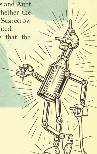
As you can see, the image I ended up with was NOT that pose. Not at all. Why is that? Because the classic axe-leaning, leg-crossing pose IS PHYSICALLY IMPOSSIBLE!!! DENSLOW YOU CHEAT, NO MACHINE WITH THE JOINTS AND PROPORTIONS THAT YOU'VE DESIGNED COULD EVER BEND THAT WAY!!!
 I have the utmost respect for Denslow as an illustrator, but MAN does he break the laws of reality with Woodman. I've redesigned Woodman more than once to give him more mobility than the Denslow design, and he STILL could NEVER cross his legs like that. So I opted instead for THIS classic pose:
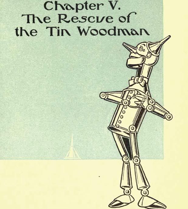
Which that knock-kneed stance STILL rendered physically impossible, so I mixed in the legs from THIS classic pose:
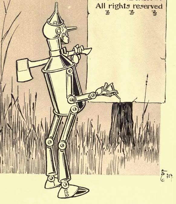
And ended up with something that hopefully still feels fairly Denslow.
Well... that's it for tonight... tell your friends...

No comments:
Post a Comment