Well, there you have it. A clumsy, jerky step forward. I'm satisfied with it, Sean's down with it, Drew was complimentary and critique-free, so I think we have a final on the animation. The compatibility issues reared their ugly heads again, though. Due to my misunderstanding of Drew's problem, I expected the fix to be easier than it was. Turned out to be fairly difficult, but it got done. We had to replicate our subdivision objects as polygon meshes for the transfer from Softimage XSI to 3DS Max, but doing so repositioned the various pieces willy-nilly. A little duplicating, position constraining, and bone parenting later, we have a successful conversion. Bone Parenting sounds like an alternative rock opera concept album about the trials of procreation. Get on that, Vampire Weekend.
So. Having animated Scarecrow's facial expressions and lip sync, and completed the Woodman modeling, texturing, rigging, and animation, my involvement in the concept scene effects work has wrapped up. I leave the remainder to much better men than myself, until the time comes for finalizing the edit. So now I turn my gaze toward other scenes. Specifically, for the moment, the Witch's introductory scene. I don't want to give away a lot, but I will talk about what I'm currently working on, which is designing the environment.
Sean and I often butt heads on this sort of thing. His tendencies lean towards realism, mine lean toward stylization. I figure when we're creating our environments, we can push our environments a little further than reality allows, he's often resistant to the degree to which I want to push it. So I'll often e-mail him with some idea I've just been hit with, and he'll express a wariness for the idea, and then it's up to me to prove that it's the right way to go. It's a dynamic that's worked pretty well for us so far, he reins me in a bit, I push him out a bit, and we meet on a superior middle-ground.
One point of contention for us has been the environment surrounding the Wicked Witch of the West's castle. I wanted a really stark contrasty sort of thing, a flat plain with this steep cliff jutting out of it, upon which the castle sits. The plains would surround it for miles, and then those would be encircled by cliffs and mountains. He wanted something more subtle, sort of a Badlands kind of vibe. The only real common ground we had was that we both agreed that it was a dried out riverbed.
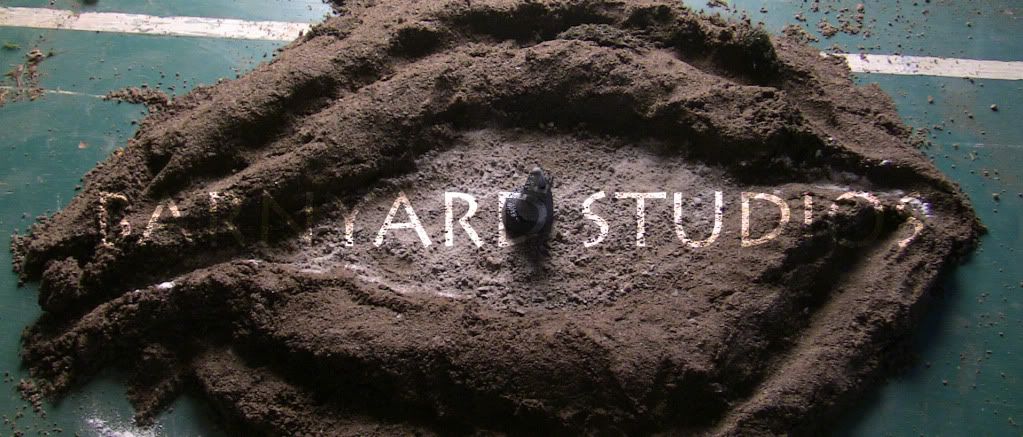
Yesterday I was hit with an idea for what I thought would be a cool aerial perspective on the environment. I quickly wrote Sean an excited e-mail, and later shared with him an animatic of the kind of shot I envisioned showcasing this design. He expressed a tentative approval of the idea, and I promised him that today would see a more specific mock-up of the idea. So I spent my afternoon playing in some dirt, and a little flour. I also chopped and painted up some tiny styrofoam bits. And broke a colored pencil. And this is what I came up with:

The tiny styrofoam protrusion is the witch's castle perched atop what once was an island. I attempted to merge my desire for starkness, my newly discovered "big picture" idea, and Sean's subtler badlands caper. Sean expressed a "LOVE" of the result, which is a word that we try not to throw around. Except when we're talking about photos of Karen Gillan. Which has nothing to do with ANYTHING, I guess.
In closing, yes, that IS my ping-pong table you can see in the edges of that photograph. My dirt bucket had less dirt in it than I would have liked. Also, points for whoever gets what's going on here with this visual.

No comments:
Post a Comment