Time to brush the dust off my keyboard. And my tongue. My poet's tongue. Time to brush the dust off my keyboard and my poet's tongue. Or, perhaps more succinctly, time for a new director journal entry. After an absolute dearth of updates, I guess it's probably time to climb back into the saddle.
For a start, the more observant among you may notice that you're reading the director journal... On a different website. It was my thought that a blog would be a little friendlier to the casual internet-goer, and writing anything at length on a Yuku message board makes one crave the icy embrace of death. Just so that the pain might end.
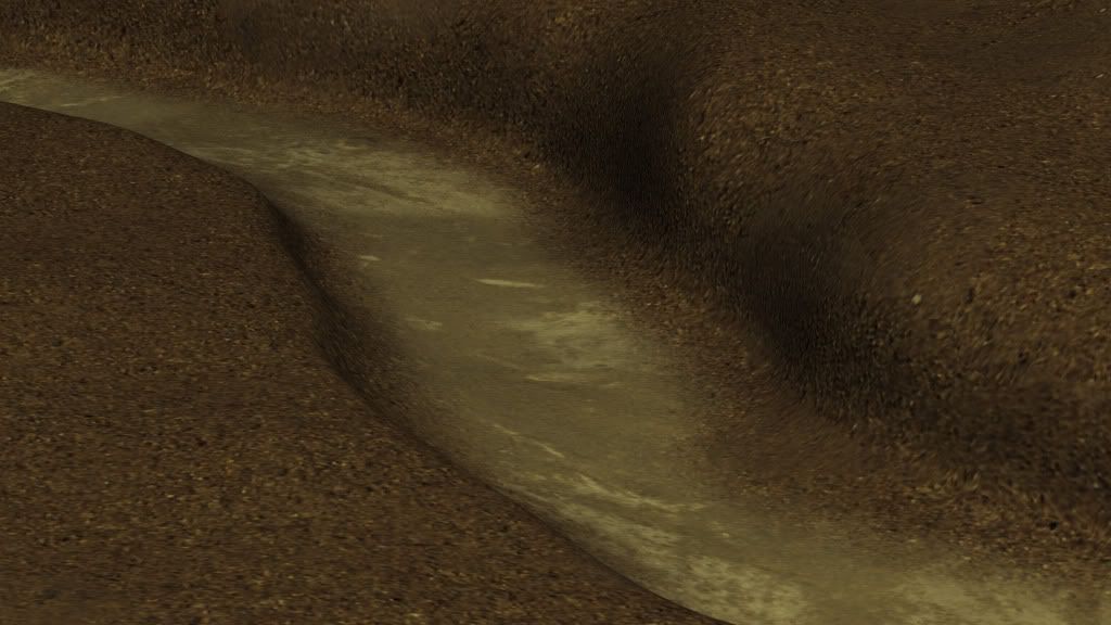
I left you all on a bit of an environmental cliffhanger last time, awaiting to hear Drew's thoughts on my environment mesh. Well, I heard them. Weeks ago, in fact. It was his quite sensible suggestion that I differentiate the type of mud found on the bottom of the riverbed from that found everywhere else. And so that's what I did. Took me a few goes before I was satisfied, but I ended up with this:
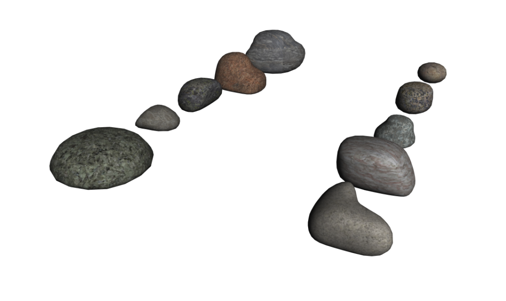
After that was done, I suggested to Drew that I might do some simple rocks which could be peppered about. He thought that was a good idea, and I then complicated it. I figured if I modeled ten rocks and created ten interchangeable textures, it would give us options for up to 100 totally unique rocks. Which is honestly probably more than we need, but whatever. Overkill is underrated. A cigar to whoever can place that quote...
It was actually quite difficult to model these rocks. Not from the standpoint of skill. No indeed, this kind of modeling is ridiculously easy. But where we were doing the interchangeable textures thing, not one of the rocks could have too recognizable a shape. Otherwise it'd be obvious that we were duplicating geometry, even though the textures had changed. So they couldn't be too radically different from one another, nor could they be too similar. Or there was no point in modeling ten of them. Here's the result of my thought experiment:
Not the most exciting of progress, but progress nevertheless. On top of that, Drew and myself have been doing a lot of work on the various trees necessary for the sequence. Which has presented the opportunity for us to streamline our workflow, and optimize efficiency, all that sort of management speak. Which I know you hate, David. But I'm going to save all that for another entry, and instead talk about what ate up the biggest chunk of my week.
As some of you will know, we're currently campaigning for funds on the website IndieGoGo. With very little success, at the moment. In an attempt to rectify that problem, I thought I might make a little video for the page. Something sort of like a teaser, but that showcased a different side of the film than our actual teaser. But at the same time, I couldn't spend the same amount of time on this that we spent on the teaser (many months). It needed to get done in a few days, which severely limited the amount of CGI I could render out for it, and forced me to rely on existing elements.
BEWARE. SPOILED MAGIC AHEAD...
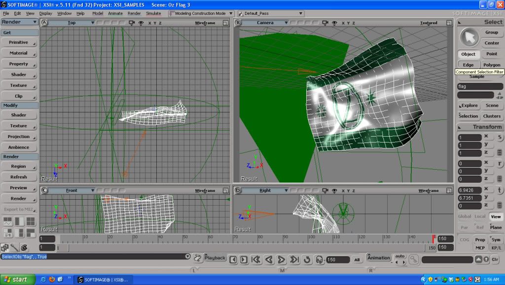
The video opens with a shot of a flag. This was a simple cloth simulation acted on by a virtual fan. Sean designed the flag and created the texture in Photoshop for me.
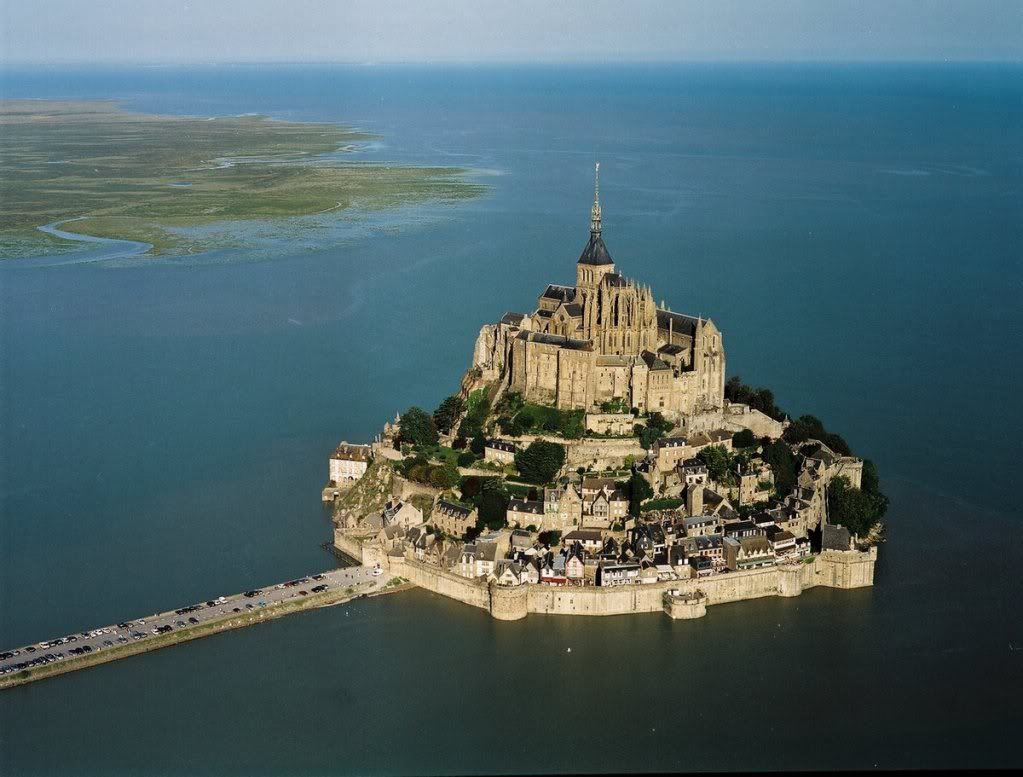
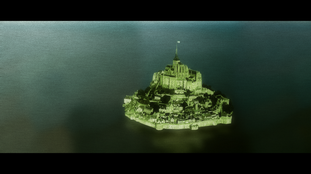
This was then modified slightly and rendered from a different angle, to be composited over this image of Mont Saint-Michel
Which I turned into this image of the Emerald City:
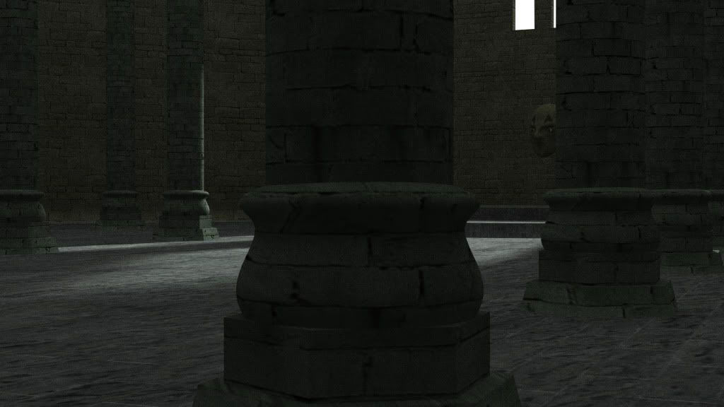
Oz in his inner sanctum was simply an animated camera over the existing throne room geometry, the creation of which I documented in an earlier journal entry.
Similarly, the Scarecrow footage is slightly modified footage from an old VFX test I'd done last fall. You can see the original in this behind the scenes video.
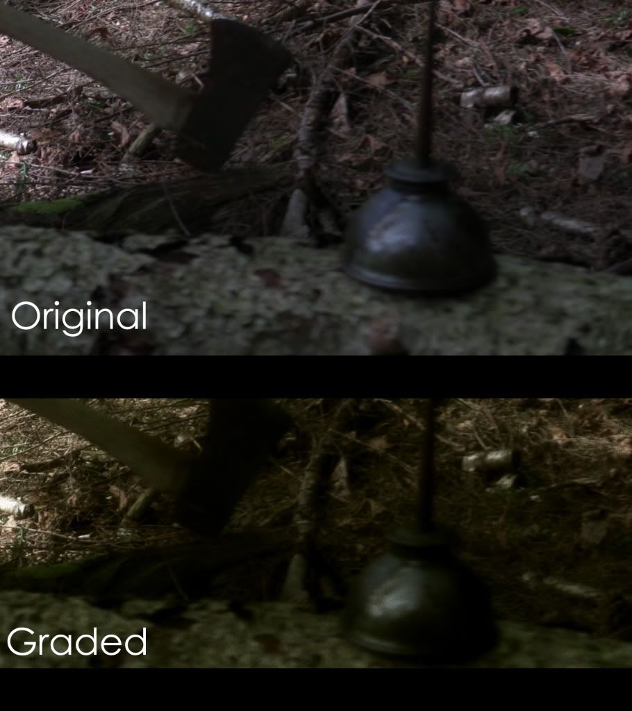
All the forest background plates were shot in the forest across the street from my house. For the first Woodman shot, I just threw the oil can on a log and dragged an axe on the ground... The only thing I did to it in the computer was a color grade and a reframe. Here's a comparison pic:
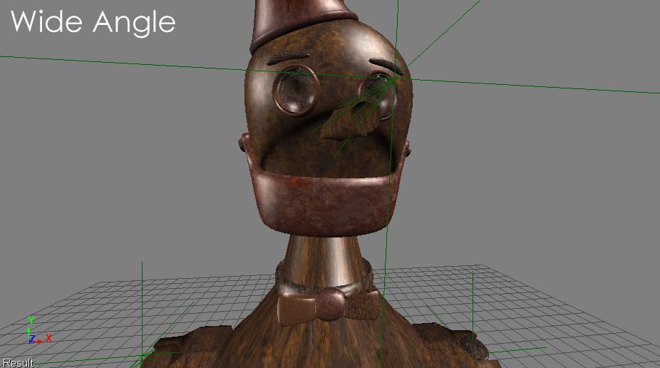
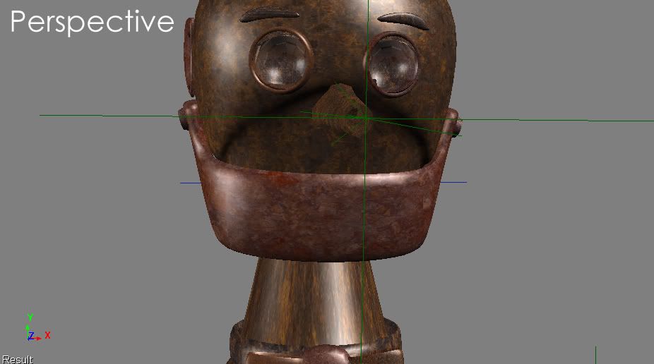
The next Woodman shot was intended to have the feel of a snorricam shot, as though the camera were affixed to the Woodman's chest. So I shot the background plate by simply walking backwards with the spiderbrace. Then, using the already rigged concept scene Tin Woodman, I did a little bit of "walking in close-up" animation, and slapped a wide-angle camera on him. Which gives some cool distortion when compared to a standard perspective camera:
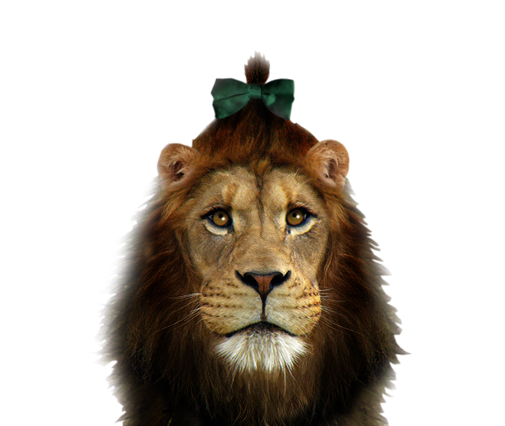
The Lion shots are total cheats. Two spiderbrace forest shots into which I hand-tracked two Sean Gates created Cowardly Lion images. The second one I animated a little blink in Photoshop to try and breathe a small amount of life into the character. But the camera work is trying its hardest to distract your mind from the staticness of the character.
The Yellow Brick Road is the image Sean created for the few Yellow Brick Road flash forwards in the original teaser trailer. I just stitched one to itself again, and ran over it with a slower virtual camera. Then I composited in the only piece of actual film footage in the whole promo. That being the very first shot we have of Dorothy walking the Yellow Brick Road in her new shoes, which will follow a quite similar sweep of the road.
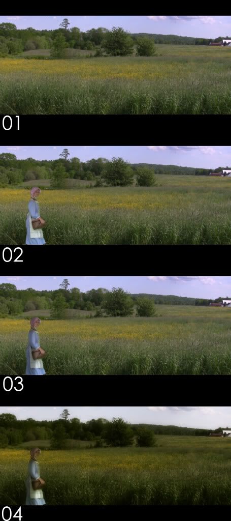
The background for the other two shots is quite literally my backyard. Like actually. If you rotated the camera one hundred and eighty degrees, the lens would be filled with the wall of my house, about ten feet away. Dorothy is extra safety footage I took of Mare on her last day (last day save pick-ups) from the same pink bonnet batch as the teaser trailer footage. As Drew did in the teaser, I added a little animated shadow on her to provide some contrast and help her sit in a bit better.
And that's how that was put together. In excruciating, minute detail. Hope SOMEBODY enjoyed it. To see the finished video, please click through to our IndieGoGo page, or you can find it on our Youtube channel.



No comments:
Post a Comment